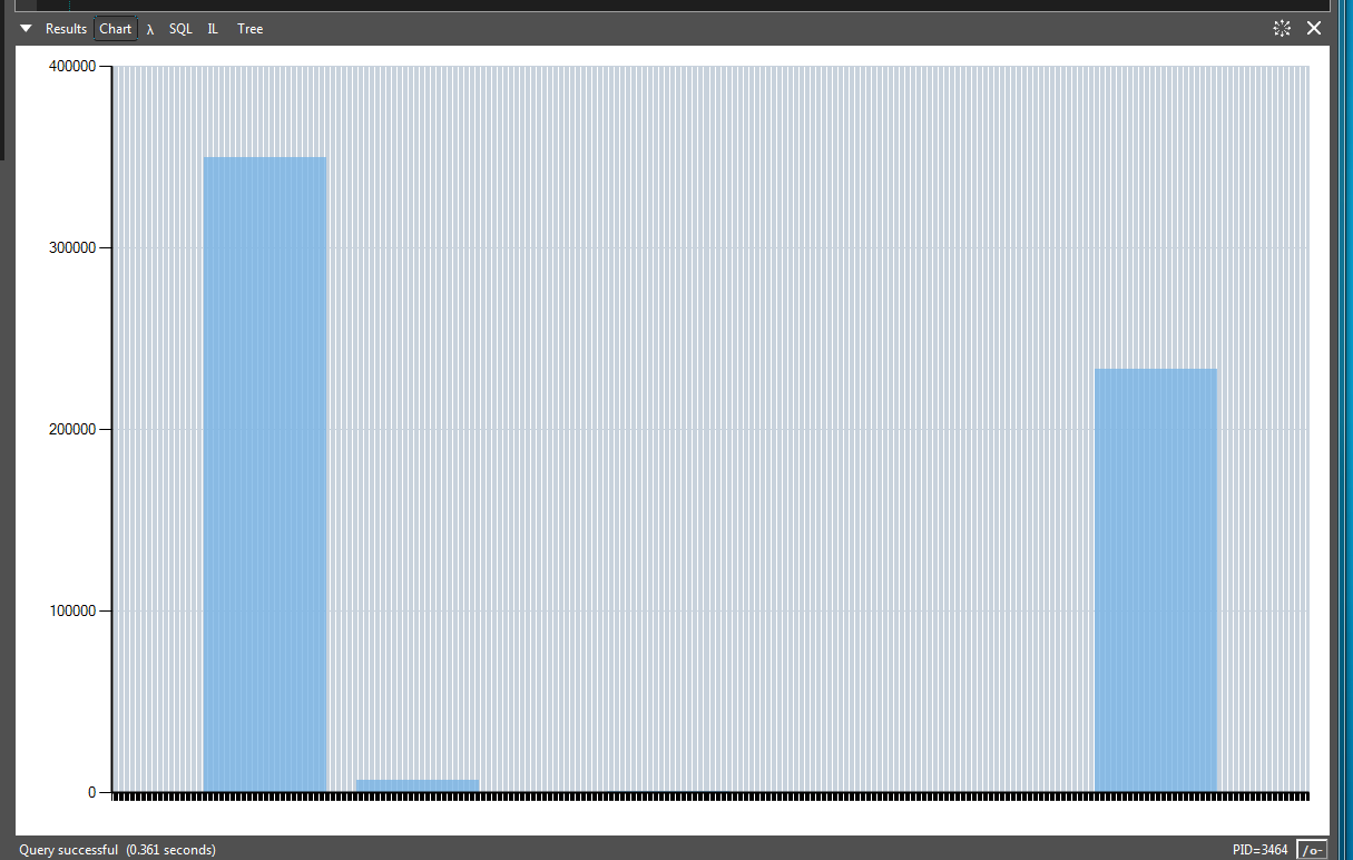
Charts guide line calculation gone haywire
Loving the new inbuilt charts feature. It means I can remove a bucket-load of code from my extensions and queries 
I have noticed some funky behaviour with the background lines on the chart and thought I would see if anyone else gets this effect.

Here's the code to reproduce:
I have noticed some funky behaviour with the background lines on the chart and thought I would see if anyone else gets this effect.

Here's the code to reproduce:
void Main()
{
	var samples = new Sample[]
	{
		new Sample { Value = 10, Count = 350000 },
		new Sample { Value = 120, Count = 7000 },
		new Sample { Value = 300, Count = 45 },
		new Sample { Value = 650, Count = 233000 },
	};

	samples.Chart(x => x.Value)
		.AddYSeries(y => y.Count, LINQPad.Util.SeriesType.Column)
		.Dump();
}

public class Sample
{
	public int Value { get; set; }
	public int Count { get; set; }
}
Comments
-
Yes.
It's because your values are very high and it is trying to display 650 vertical lines.
If you treat your values as strings rather than integers , eg x=>x.Value.ToString() , then the extra lines disappear. -
I tried your suggestion and while it works, it introduces other problems in the code I am using it in (this is a boiled down version to illustrate the strange behaviour).
To maybe highlight better why I think there is still a design issue or bug here, I have made another sample.
So in the sample below, I have added a new value at zero (to help the spike stand out from the edge of the graph) and I sliced the set into two parts. I then insert a number of blank samples 121 through to 216 each with a count of zero.
The vertical range is still the same (highest count being 350000 and the horizontal range is still the same 10 to 650 (if you ignore the new 0,0 value at the start).
So in this example you will see a reasonable number of vertical graph guide lines - but when you reduce the count of the middle values in the Enumerable Range down by 1 you get the crazy number of guide lines.
I'm not sure if this is a problem with the LINPad wrapper or whether it's a problem in the underlying data visualisation library itself (which I think the LP charts feature is built on).
void Main()
{
	var samplesLeft = new Sample[]
	{
		new Sample { Value = 0, Count = 0 },
		new Sample { Value = 10, Count = 350000 },
		new Sample { Value = 120, Count = 7000 },
	};

	var samplesMiddle = Enumerable
		.Range(121, 95) // <-- change 95 to 94 and you get a crazy number of vertical lines
		.Select(e =>
			new Sample
			{
				Value = e,
				Count = 0
			});

	var samplesRight = new Sample[]
	{
		new Sample { Value = 300, Count = 45 },
		new Sample { Value = 650, Count = 233000 },
	};

	var finalSet = samplesLeft.Concat(samplesMiddle).Concat(samplesRight);

	finalSet.Chart(x => x.Value)
		.AddYSeries(y => y.Count, LINQPad.Util.SeriesType.Column)
		.Dump();
}

public class Sample
{
	public int Value { get; set; }
	public int Count { get; set; }
} -
Looks like if the total number of columns is 100 or more, then it doesn't try to draw them all.
I noticed there is a method ToWindowsChart which returns a System.Windows.Forms.DataVisualization.Charting.Chart which give you more control and you can disable the column intervals , egvar wc = finalSet.Chart(x => x.Value) .AddYSeries(y => y.Count, LINQPad.Util.SeriesType.Column).ToWindowsChart(); wc.ChartAreas[0].AxisX.Interval = 0; wc.Dump();
or you can set the interval manuallywc.ChartAreas[0].AxisX.Minimum = 0; wc.ChartAreas[0].AxisX.Interval = 20;
-
Thanks sgmoore. I will probably do that for now.
I'm actually using the underlying chart to control the colour of individual data points (columns in my case). In your earlier suggestion to cast as string it would break that colouring, even if I converted them back to integers.
PS. I noticed you're using code tags for code snippets. I'm using pre tags to get the nice box and colour coding. Maybe something is up with the CSS for the forum.
var val = int.Parse(series.Points[i].XValue.ToString());
...
series.Points[i].Color = colours[Lookup(val)]; -
Thanks for the tip. I'll try to remember to use pre tags in future.
